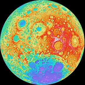

A color-shaded relief map of the far side of the moon. Image courtesy of NASA's Goddard Space Flight Center/DLR/ASU.
Drew Skau has a message for NASA:
"The visualization community has noticed your insistence on using rainbow color scales for representing continuous data. This is a plea to you (and anyone else doing the same thing) to stop."
Skau, a PhD computer science visualization student at the University of North Carolina - Charlotte, gives several reasons why rainbow color scales are a bad idea:
- Color-blind people , whereas they can use .
- The divisions between hues create edges in visualizations that are not actually significant.
- The spectral order of hues has no inherent and intuitive meaning.
- Because the color yellow activates both red and green cones in our eyes, the color appears more intensely bright, making it stand out. Most rainbow scales do nothing to compensate for this type of artifact.
- Detail is actually harder to see in a rainbow.
Want the details? Check out Skau's , a visualization startup for which Skau occasionally works.
As for Skau's request, for the sake of accessibility, we hope that his pleas will be heard. But we sure will miss the pretty rainbows!
Via .